Introduction of DataGrid Control in VB.NET
DataGridControl, Data Grid control in vb.net, .vb.net, visual basic 2010
DataGrid Control
The Windows Forms DataGrid control provides a user interface to ADO.NET datasets, displaying tabular data and allowing for updates to the data source. When the DataGrid control is set to a valid data source, the control is automatically populated, creating columns and rows based on the shape of the data. The DataGrid control can be used to display either a single table or the hierarchical relationships between a set of tables.
Introduction to the Windows Forms DataGrid Control
The Windows Forms DataGrid control displays data in a series of rows and columns. The simplest case is when the grid is bound to a data source with a single table containing no relationships. In that case, the data appears in simple rows and columns, as in a spreadsheet. For details about binding data to other controls, see Data Binding and Windows Forms.
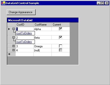
If the DataGrid is bound to data with multiple related tables, and if navigation is enabled on the grid, the grid will display expanders in each row. An expander allows navigation from a parent table to a child table. Clicking a node displays the child table, and clicking the Back button displays the original parent table. In this fashion, the grid displays the hierarchical relationships between tables.
A DataGrid bound to data with multiple tables
The DataGrid can provide a user interface for a dataset, navigation between related tables, and rich formatting and editing capabilities.
The display and manipulation of data are separate functions: The control handles the user interface, while data updates are handled by the Windows Forms data-binding architecture and by .NET Framework data providers. Therefore, multiple controls bound to the same data source will stay in sync.
Visual Basic Note If you are familiar with the DataGrid control in Visual Basic 6.0, you will find some significant differences in the Windows Forms DataGrid control. For details, see DataGrid Control Changes in Visual Basic .NET.
When the grid is bound to a DataSet object, the columns and rows are automatically created, formatted, and filled. For details, see Data Binding and Windows Forms. Following the generation of the DataGrid control, columns can be added, deleted, rearranged, and formatted as needed.
Binding Data to the Control
In order for the DataGrid control to work, it should be bound to a data source using the DataSource and DataMember properties at design time or the SetDataBinding method at run time. This binding points the DataGrid to an instantiated data-source object (such as a DataSet or DataTable), with the DataGrid control showing the results of actions that are performed on the data. Most data-specific actions are not performed through the DataGrid, but instead through the data source.
If the data in the bound dataset is updated through any mechanism, the DataGrid control reflects the changes. If the data grid and its table styles and column styles have the ReadOnly property set to false, the data in the dataset can be updated through the DataGrid control.
Only one table can be shown in the DataGrid at a time. If a parent-child relationship is defined between tables, the user can navigate between the related tables to select the table to be displayed in the DataGrid control. For information about binding a DataGrid control to an ADO.NET data source at either design time or run time, see Binding the Windows Forms DataGrid Control to a Data Source.
Valid data sources for the DataGrid include:
There are other possible data sources, but the above are the most typical. For more information about possible data sources, see Binding the Windows Forms DataGrid Control to a Data Source.
The DataGrid control can be used to display either a single table or the hierarchical relationships between a set of tables. When the DataGrid control is displaying a table and the AllowSorting property is set to true, data can be resorted by clicking the column headers. The user can also add rows and edit cells.
The relationships between a set of tables are displayed using a parent/child structure of navigation. Parent tables are the highest level of data, and child tables are those data tables that are derived from the individual listings in the parent tables. Expanders are displayed in each parent row that contains a child table. Clicking an expander generates a list of Web-like links to the child tables, which when selected cause the child tables to be displayed. Clicking the "show/hide parent rows" icon () will hide the information about the parent table (or cause it to reappear if you have previously hidden it). A back button allows navigation back to the previously viewed table.
Columns and Rows
The DataGrid consists of a collection of DataGridTableStyle objects contained in the DataGrid control's TableStyles property. A table style may contain a collection of DataGridColumnStyle objects contained in the DataGridTableStyle object's GridColumnStyles property. You can edit the TableStyles and ColumnStyles properties with collection editors accessed through the Properties window.
Any DataGridTableStyle object associated with the DataGrid control can be accessed through the GridTableStylesCollection. The GridTableStylesCollection can be edited in the designer with the DataGridTableStyle Collection Editor, or programmatically through the DataGrid control's TableStyles property.
Objects included in the DataGrid control
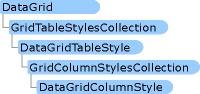
Table styles and column styles are synchronized with DataTable objects and DataColumn objects by setting their MappingName properties to the appropriate TableName and ColumnName properties. When a DataGridTableStyle object with no column styles is added to a DataGrid control bound to a valid data source, and the MappingName property of that table style is set to a valid TableName property, a collection of DataGridColumnStyle objects is created for that table style. For each DataColumn object found in the Columns collection of the DataTable object, a corresponding DataGridColumnStyle object is added to the GridColumnStylesCollection object, which is accessed through the DataGridTableStyle object's GridColumnStyles property. Columns can be added or deleted from the grid using the Add or Remove method on the GridColumnStylesCollection object. For details, see Adding Tables and Columns to the Windows Forms DataGrid Control and Deleting Columns in the Windows Forms DataGrid Control.
A collection of column types extends the DataGridColumnStyle class with rich formatting and editing capabilities. All of the column types inherit from the DataGridColumnStyle base class. The class that is created depends on the DataType property of the DataColumn object from which the DataGridColumn is based. For example, a DataColumn object with its DataType property set to System.Boolean will be associated with the DataGridBoolColumn. The following table describes each of these column types.
| Column Type |
Description |
| DataGridTextBoxColumn |
Accepts and displays data as formatted or unformatted strings. Editing capabilities are the same as they are for editing data in a simple TextBox. Inherits from DataGridColumnStyle. |
| DataGridBoolColumn |
Accepts and displays true, false, and null values. Inherits from DataGridColumnStyle. |
Double-clicking the right edge of a column resizes the column to display its full caption and widest entry.
Formatting
Formatting that can be applied to the DataGrid control includes border styles, gridline styles, fonts, caption properties, data alignment, and alternating background colors between rows. For details, see Formatting the Windows Forms DataGrid Control.
Events
Aside from the common control events such as MouseDown, Enter, and Scroll, the DataGrid control supports events associated with editing and navigation within the grid. The CurrentCell property determines which cell is selected. The CurrentCellChanged event is raised when the user navigates to a new cell. When the user navigates to a new table (via parent/child relations), the Navigate event is raised. The BackButtonClick event is raised when the user clicks the back button when viewing a child table, and the ShowParentDetailsButtonClick event is raised when the "show/hide parent rows" icon is clicked.