Create ToolTip in WPF using VB.NET
In this article you will learn about the ToolTip creation in WPF.
ToolTip
A ToolTip is a ContentControl, is actually just a container like a panel or grid and pretty much anything that you can put into a container you can now use in a tooltip. It is a very important part of any modern software. It helps and suggests what to do with any user interaction item control or what a particular content or legends means.
You use a ToolTip control to provide information to the user. For example, you can use a ToolTip to provide the name of a Button or a ToolBar in a ToolBarTray. You can also tweak various timing settings to control how quickly tooltips appear and disappear. The easiest way to show a tooltip doesn't involve using the ToolTip class directly. Instead, you simply set the ToolTip property of your element. The ToolTip property is defined in the FrameworkElement class, so it's available on anything you'll place in a WPF window.
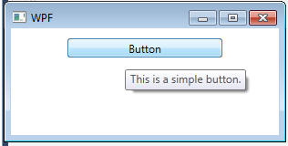
Example of an simple ToolTip
<Window x:Class="WpfApplication1.Window1"
xmlns="http://schemas.microsoft.com/winfx/2006/xaml/presentation"
xmlns:x="http://schemas.microsoft.com/winfx/2006/xaml"
Title="WPF" Height="155" Width="310">
<StackPanel Name="stackPanel1">
<Button Height="21" Margin="11" Name="button1"
ToolTip="This is a simple button." Width="170">
Button
</Button>
</StackPanel>
</Window>
Output Window
The properties of the ToolTip class are used to define the position and behavior of the tooltipThe ToolTip is a content control, so you can adjust standard properties such as the Background, Padding, and Font. You can also modify the members that are defined in the ToolTip class. Most of these properties are designed to help you place the tooltip exactly where you want it.
Properties of ToolTips
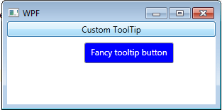
Example of a fancy ToolTip
<Window x:Class="WpfApplication1.Window1"
xmlns="http://schemas.microsoft.com/winfx/2006/xaml/presentation"
xmlns:x="http://schemas.microsoft.com/winfx/2006/xaml"
Title="WPF" Height="155" Width="310">
<StackPanel Name="stackPanel1">
<Button>
<Button.ToolTip>
<ToolTip Background="Blue" Foreground="White"
HasDropShadow="False" >
<StackPanel>
<TextBlock Margin="3" >Fancy tooltip button</TextBlock>
</StackPanel>
</ToolTip>
</Button.ToolTip>
<Button.Content>Custom ToolTip</Button.Content>
</Button>
</StackPanel>
</Window>
Output Window
Conclusion
Hope this article helps you to understand the ToolTip in WPF.