In this article we will learn how to create and use Calendar control in Silverlight 4.
Calendar control
Calendar control is a control that allows the user to select a date.
Properties - These are the following properties of the Calendar control.
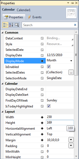
Figure 1.
DisplayMode - Gets or sets the value indicating whether calendar is displayed months, years and decades.
SelectionMode -Indicating that What kinds of selection is allowed such as singleDate,SingleRange, MultipleRange,None.
DisplayDateStart - Gets or sets the first date to be displayed.
DisplayDateEnd - Gets or sets the last date to be displayed.
BlackoutDates - property can be used to specify dates that cannot be selected.
IsTodayHighlighted - By default, Today is highlighted. This can be disabled by setting IsTodayHighlighted to false.
SelectedDates - The SelectedDate property represents the currently selected date.
Creating a calendar in XAML
<sdk:Calendar Height="169" HorizontalAlignment="Left" Margin="10,10,0,0" Name="Calendar1"VerticalAlignment="Top" Width="230" />
The Width and Height attributes of the Calendar element represent the width and the height of a Calendar. The Content attribute represents the text of a Calendar. The X:Name attribute represents the name of the control, which is a unique identifier of a control.
The default view of the Calendar control looks like this.
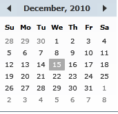
Figure 2.
DisplayMode
The DisplayMode property are used to represents the format of display of a Calendar, which can be a month, year, or decade. Month is the default mode. By setting the DisplayMode to Year and Decade shows Figure 3 and Figure 4 respectively.
The default month view of the Calendar control looks like this.
.gif)
Figure 3.
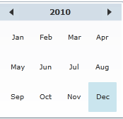
Figure 4.
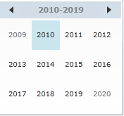
Figure 5.
Suppose we set the property on decade and run the application and click on the 2014 then 2014 calendar will be display.
The following code sets the DisplayMode property to Decade.
<sdk:Calendar Height="169" HorizontalAlignment="Left" Margin="10,10,0,0" Name="Calendar1"VerticalAlignment="Top" Width="230" DisplayMode="Decade" />
BlackoutDates
The BlackoutDates property of the Calendar are used to represents a collection of dates that are not available for selection. All non selection dates are marked by a cross. For example, say in dec month of year 2010, we would like to block dates from Dec 1st to Dec 4th the calendar should look like this.
Add the following code.
Public Sub New()
InitializeComponent()
Calendar1.BlackoutDates.Add(New CalendarDateRange(New DateTime(2010, 12, 1), NewDateTime(2010, 12, 4)))
End Sub
Now run the application.
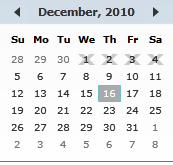
Figure 6.
DisplayDateStart and DisplayDateEnd
The Calendar control allows you to set the start and end display dates by using the DisplayDateStart and DisplayDateEnd properties.
For example we want to display the date only for December 1 to 31. that means starting date is 1 and ending
date is 31 in the calendar.
Now selecting both the property.
DisplayDateStart - 12/1/2010
DisplayDateEnd - 12/31/2010
The form looks like this.
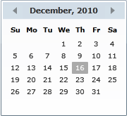
Figure 7.
FirstDayOfWeek and IsTodayHighlighted
By default, Sunday is the first day of week. If you would like to change it, you use FirstDayOfWeek property. The IsTodayHightlighted property is used to make today highlighted.
Select calendar control on the form and press F4 to property window and set these property. such as
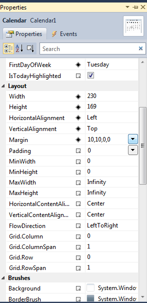
Figure 8.
The form looks like this.
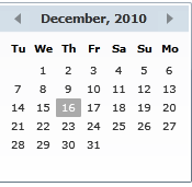
Figure 9.
Calendar by default Event
On the SelectedDateChanged event handler, we set the TextBox. Text property to the SelectedDate property of the Calendar control.
Private Sub Calendar1_SelectedDatesChanged(ByVal sender As System.Object, ByVal e AsSystem.Windows.Controls.SelectionChangedEventArgs) Handles Calendar1.SelectedDatesChanged
TextBox1.Text = Calendar1.SelectedDate.ToString()
End Sub
Now run the application and select date from the calendar it will be display on the Textbox control.
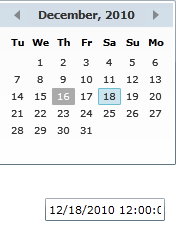
Figure 10.
Setting Image as Background of a Calendar
To set an image as background of a Calendar, we can set an image as the Background of the Calendar.
XAML Code:
<sdk:Calendar.Background>
<ImageBrush ImageSource="/SilverlightApplication27;component/Images/flowers-image.jpg" />
</sdk:Calendar.Background>
The form looks like this.
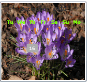
Figure 11.