In this article we will learn how to use Grid control in Silverlight 4 using VB.NET.
Grid control
Grid control is also called the layout control. It is conceptually similar to an HTML Table element. The Grid control is the most flexible layout panel, and supports arranging controls in multi-row and multi-column layouts.
Creating Grid control in XAML
<Grid x:Name="LayoutRoot" Background="White" Width="400" ShowGridLines="True"></Grid>
The Width and Height property represents the width and the height of the control. Name property represents name of the control.
Properties - This control has the following properties. Property window looks like this.
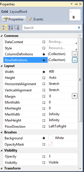
Figure 1
RowDefinitions - RowDefinitions collections is used to specify number of rows in Grid control.
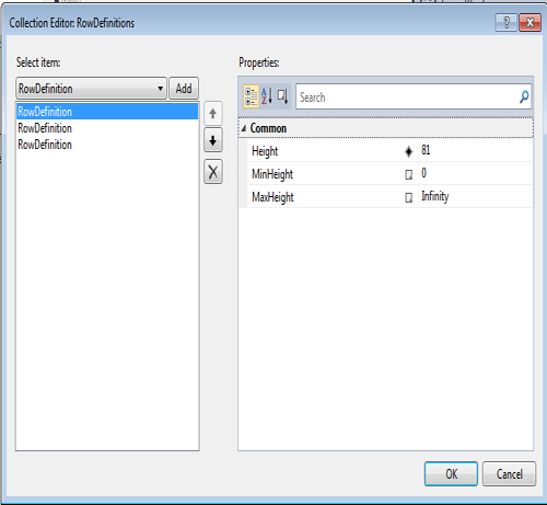
Figure 2.
ColumnDefinitions - ColumnDefinitions collections is used to specify number of columns in Grid control.
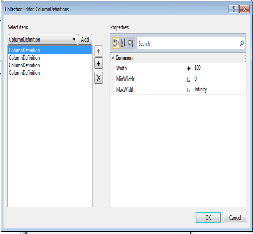
Figure 3.
ShowGridLines - ShowGridLines="True" This indicates that the grid lines will be visible. You can always set this property to False if you want to hide the grid lines.
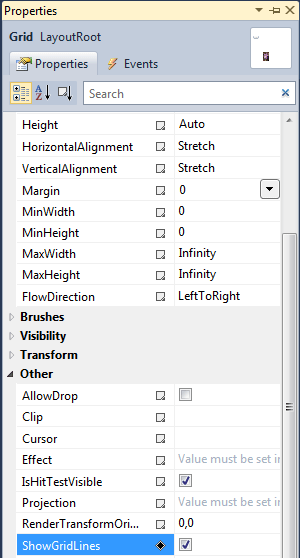
Figure 4.
Column Width, and Row Height
To provide the most flexibility, Grid columns and rows are sized by GridLength objects which use the GridUnitType, which in turn allows you to choose among:
Auto (size based on the size properties of the object being placed in the grid).
Pixel (size in pixels).
Star (size based on a weighted proportion of the available space).
For example
The following example explains how to use a Grid and how to create rows and columns:
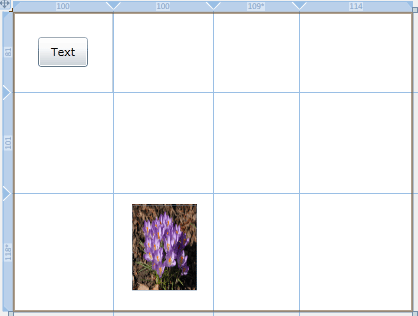
Figure 5.
XAML code
<Grid x:Name="LayoutRoot" Background="White" Width="400" ShowGridLines="True">
<UserControl x:Class="SilverlightApplication52.MainPage"
xmlns="http://schemas.microsoft.com/winfx/2006/xaml/presentation"
xmlns:x="http://schemas.microsoft.com/winfx/2006/xaml"
xmlns:d="http://schemas.microsoft.com/expression/blend/2008"
xmlns:mc="http://schemas.openxmlformats.org/markup-compatibility/2006"
mc:Ignorable="d"
d:DesignHeight="300" d:DesignWidth="400"xmlns:sdk="http://schemas.microsoft.com/winfx/2006/xaml/presentation/sdk">
<Grid x:Name="LayoutRoot" Background="White" Width="400" ShowGridLines="True">
<Grid.RowDefinitions>
<RowDefinition Height="81"></RowDefinition>
<RowDefinition Height="101"></RowDefinition>
<RowDefinition Height="118*"></RowDefinition>
</Grid.RowDefinitions>
<Grid.ColumnDefinitions>
<ColumnDefinition Width="100"></ColumnDefinition>
<ColumnDefinition Width="100"></ColumnDefinition>
<ColumnDefinition Width="109*"></ColumnDefinition>
<ColumnDefinition Width="114"></ColumnDefinition>
</Grid.ColumnDefinitions>
<Button x:Name="btnTest" Width="50" Height="30" Content="Text" Grid.Row="0"Grid.Column="0"></Button>
<Image />
<Image Height="86" HorizontalAlignment="Left" Margin="19,11,0,0" Name="Image1"Stretch="Fill" VerticalAlignment="Top" Width="65" Grid.Column="1" Grid.Row="2"Source="/SilverlightApplication52;component/Images/flowers-image.jpg" />
</Grid>
</UserControl>
Now run the application without ShowGridLines property.
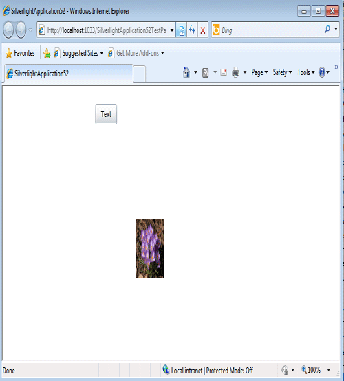
Figure 6.
Now run the application with ShowGridLines property.
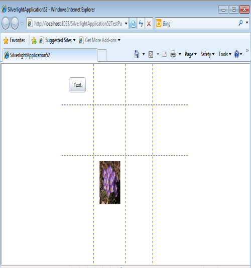
Figure 7.