Introduction: In this article we will look the use of silverlight layout control. When we design interface control for our application, then we should design interface control in a way that it looks consistent when the user resize the window or when it runs on different devices or computers. Silverlight provide flexible manner for designing user interface. There are three main layout control in silverlight, then are below
Canvas: The canvas control is simplest layout control. It provides free area for designing user interface. For working with it, take a silverlight application and write the following XAML code in editor
<Canvas x:Name="LayoutRoot" Background="White">
</Canvas >
Then, take four Buttons on design surface. The code will look like below
<Canvas x:Name="LayoutRoot" Background="White">
<Button Canvas.Left="10" Canvas.Top="10" Content="Button" Height="23" Name="button1"Width="75" />
<Button Canvas.Left="10" Canvas.Top="43" Content="Button" Height="23" Name="button2"Width="75" />
<Button Canvas.Left="10" Canvas.Top="76" Content="Button" Height="23" Name="button3"Width="75" />
<Button Canvas.Left="10" Canvas.Top="109" Content="Button" Height="23" Name="button4"Width="75" />
</Canvas >
The objects inside the canvas is positioned by X and Y co-ordinate according to their position in canvas. The Canvas.Top and Canvas.Left are two special property of this control, which is used for representing X and Y co-ordinate values of pixels of control in canvas.
On design surface, buttons will look like figure 1
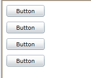
Figure-1
Grid: The grid layout control allow us to place design control in row-column format. we can set numbers of rows and columns as our need by RowDefinitions and ColumnDefinitions properties of grid. The XAML code will look like below in editor after taking four columns and five rows
<Grid x:Name="LayoutRoot" Background="White">
<Grid.ColumnDefinitions>
<ColumnDefinition />
<ColumnDefinition />
<ColumnDefinition />
<ColumnDefinition />
</Grid.ColumnDefinitions>
<Grid.RowDefinitions>
<RowDefinition />
<RowDefinition />
<RowDefinition />
<RowDefinition />
<RowDefinition />
</Grid.RowDefinitions>
</Grid>
And design surface will look like figure 2
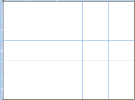
Figure-2
we can take user interface control grid cells as below figure
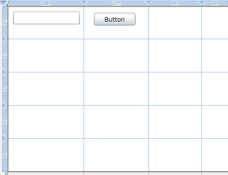
Figure-3
StackPanel: StackPanel puts control in horizontally or vertically stack format. For working with it, we take a silverlight application and then a stackpanel. after that we take four buttons. The XAML code will be
<StackPanel Height="100" Name="stackPanel1" Width="200">
<Button Content="Button" Height="23" Name="button1" Width="75" />
<Button Content="Button" Height="23" Name="button2" Width="75" />
<Button Content="Button" Height="23" Name="button3" Width="75" />
<Button Content="Button" Height="23" Name="button4" Width="75" />
</StackPanel>
Buttons will be automatically arrange in vertical form. it can be set as vertical or horizontal by Orientation property. For above XAML code it will look like figure 4
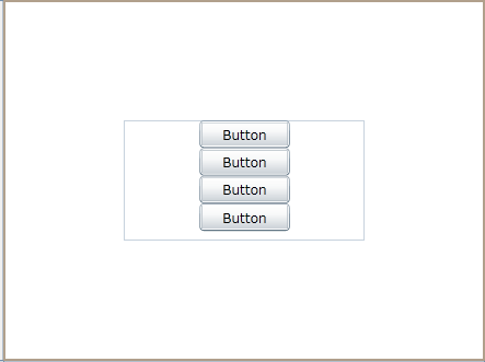
Figure-4