In this article we will learn how to crate and use TextBlock control in Silverlight 4.
TextBlock control
The TextBlock control are used to display the text. This control allows you to render read only text.
Properties - These are the following properties of this control.
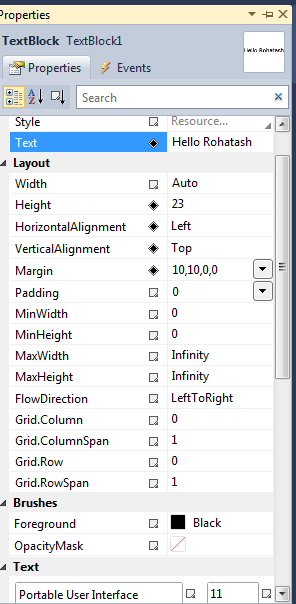
Figure 1.
The Width property of the TextBlock element represent the width of a TextBlock.
The Height property of the TextBlock element represent the width and the height of a TextBlock.
The Text property of the TextBlock element represents the content of a TextBlock.
The Foreground property sets the foreground color of contents or text.
Margin Gets or sets the outer margin of a TextBlock control.
MaxHeight Gets or sets the maximum height constraint of a TextBlock control.
MaxWidth Gets or sets the maximum width constraint of a TextBlock control.
Opacity Gets or sets the degree of the object's opacity.
Creating a TextBlock
Creating a TextBlock control in XAML.
<TextBlock Height="23" HorizontalAlignment="Left" Margin="10,10,0,0" Name="TextBlock1"Text="Hello, Rohatash" VerticalAlignment="Top" />
The output looks like this.
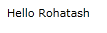
Figure 2.
Creating a dynamically TextBlock control.
Now creates a TextBlock object and sets its properties such as - width, height, Text and foreground and later the TextBlock is added to the LayoutRoot and double click on the form and add the following code.
Private Sub UserControl_Loaded(ByVal sender As System.Object, ByVal e AsSystem.Windows.RoutedEventArgs) Handles MyBase.Loaded
Dim txtBlock As New TextBlock()
txtBlock.Height = 50
txtBlock.Width = 200
txtBlock.Text = "Hello, Rohatash"
txtBlock.Foreground = New SolidColorBrush(Colors.Green)
LayoutRoot.Children.Add(txtBlock)
End Sub
The output looks like this.

Figure 3.
There are also a variety of options you can apply to your font.
FontFamily - The font typeface family name.
<TextBlock FontFamily="Courier New">Hello, Rohatash</TextBlock>
<TextBlock FontFamily="Times New Roman" Canvas.Top="10">Hello, Rohatash</TextBlock>
<TextBlock FontFamily="Verdana" Canvas.Top="20">Hello, Rohatash</TextBlock>
The output looks like this.
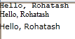
Figure 4.
FontSize - The font size is the size in pixels.
<TextBlock FontSize="10">Hello, Rohatash</TextBlock>
<TextBlock FontSize="20" Canvas.Top="20">Hello, Rohatash</TextBlock>
<TextBlock FontSize="30" Canvas.Top="50">Hello, Rohatash</TextBlock>
The output looks like this.
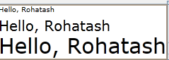
Figure 5.
FontWeight - FontWeight has the following option. such as Thin, ExtraLight, Light, Normal, Medium, SemiBold, Bold, ExtraBold, Black, ExtraBlack.
<TextBlock Text="Hello, Rohatash" FontWeight="Normal" Canvas.Top="0"></TextBlock>
<TextBlock Text="Hello, Rohatash" FontWeight="Bold" Canvas.Top="10"></TextBlock>
The output looks like this.
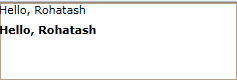
Figure 6.
Foreground - This allows you to change the color of the font.
<TextBlock Text="Hello, Rohatash" FontSize="30" FontFamily="Arial" Canvas.Top="0"> <TextBlock.Foreground>
<LinearGradientBrush>
<GradientStop Color="#FF0000FF" Offset="0.0" />
<GradientStop Color="#FFEEEEEE" Offset="1.0" />
</LinearGradientBrush>
</TextBlock.Foreground>
</TextBlock>
<TextBlock Text="Hello, Rohatash" FontSize="30" FontFamily="Arial" Canvas.Top="20"Foreground="Red" Margin="0,34,0,-34"></TextBlock>
The output looks like this.
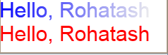
Figure 7.
TextDecorations - A text decoration is a visual ornament that you can add to text.
<TextBlock TextDecorations="underline" TextWrapping="Wrap">Hello, Rohatash</TextBlock>
The output looks like this.
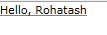
Figure 8.
Runs - we can inter-mix different runs of text formatting within the same block using the Run element. For example, you can display a string like this:
<TextBlock Margin="0,12,0,-12">
<Run FontWeight="Bold">Hello, Rohatash</Run>
<Run Foreground="Red">How are you?</Run>
<Run FontStyle="Italic">I am fine thanks!</Run>
</TextBlock>
The output looks like this.

Figure 9.