GroupBox control WPF in VB.NET
This article demonstrates how to create and use the GroupBox control in WPF using XAML.
This article demonstrates how to create and use the GroupBox control in WPF using XAML.
GroupBox control
The GroupBox control display a frame around them and also allows to display captions to them which is not possible with the Panel control. GroupBox control is used to creates a container that has a border and a header for user interface content.
Creating GroupBox control
<GroupBox Header="GroupBox1" Height="175" HorizontalAlignment="Left" Margin="10,10,0,0" Name="GroupBox1"
VerticalAlignment="Top" Width="370"/>
The Width and height properties of the GroupBox control are used to set the width and height of the control and Name property is the property which has the unique name of a GroupBox control.
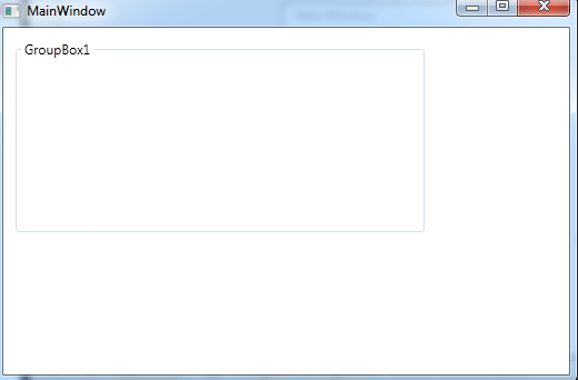
Figure1.gif
Important Property
Header - Header property is represents the header text of a GroupBox control.
Foreground and Background property
The BackColor and ForeColor properties are used to set background and foreground color of a GroupBox control.
For example
Creating a Tab control inside the Group control in XAML.
<Window x:Class="MainWindow"
xmlns="http://schemas.microsoft.com/winfx/2006/xaml/presentation"
xmlns:x="http://schemas.microsoft.com/winfx/2006/xaml"
Title="MainWindow" Height="350" Width="525">
<Grid>
<GroupBox Header="GroupBox1" Height="244" HorizontalAlignment="Left" Margin="10,10,0,0" Name="GroupBox1" VerticalAlignment="Top" Width="370"/>
<TabControl Height="204" HorizontalAlignment="Left" Margin="44,39,0,0" Name="TabControl1" VerticalAlignment="Top" Width="299">
<TabItem Header="Picture" Name="TabItem1">
<Grid>
<Image Height="150" HorizontalAlignment="Left" Margin="10,10,0,0" Name="Image1" Stretch="Fill" VerticalAlignment="Top" Width="200" Source="/WpfApplication75;component/Images/image1.jpg.gif" />
</Grid>
</TabItem>
<TabItem Header="XAML code" Name="TabItem2"></TabItem>
</TabControl>
</Grid>
</Window>
Now run the application.
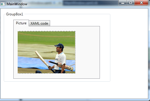
Figure2.gif