XAML is a new descriptive programming language developed by Microsoft to write user interfaces for next generation managed applications. This article is a basic introduction to XAML.
The Root Element:
The root element of the XAML must have namespace defined as following:
xmlns="http://schemas.microsoft.com/winfx/2006/xaml/presentation
The root element of an XAML document can contain only certain elements and these elements are a Window, a Canvas, or panels. XAML has different types of panels used for different purposes. I will be talking about panels in more details in my forthcoming articles.
Windows and Canvas:
Once the root element is defined, children are defined within the root element. For example, the following XAML code creates a Window and a Button as the child of the window.
Listing 1:
<Window xmlns="http://schemas.microsoft.com/winfx/2006/xaml/presentation xmlns:x="http://schemas.microsoft.com/winfx/2006/xaml">
<Button>Hello World</Button>
</Window>
The <Window> element represents a window, which replaces a Windows Form or ASP.NET Web page in previous Microsoft development platforms and the <Button> element represents a button control.
The above code generates the following output:
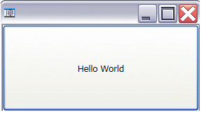
Figure 1: A Window generated using XAML
Here is another example. In this example, I use <Canvas> element as the root element. Again, a canvas can be treated as a parent control of other child controls.
Listing 2:
<Canvas xmlns="http://schemas.microsoft.com/winfx/2006/xaml/presentation" xmlns:def="Definition">
<Button>XAML Button</Button>
</Canvas>
The above code generates output as Figure 2. As you can see from Figure 2, an XAML document is rendered directly by the browser.
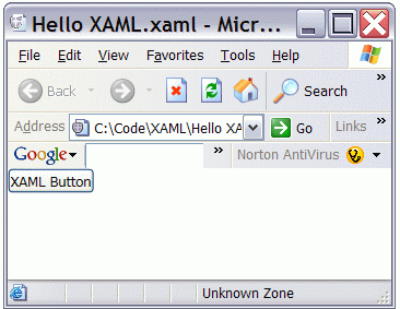
Figure 2: Button control
XAML Control Attributes:
Each of the elements such as <Window> or <Button> has attributes and can be set within the element itself. For example, a Button has Height, Width, Background, Foreground and other attributes, which represents height, width, foreground color, and background color of the button respectively.
The following code snippet sets the Id, height, width, background color, foreground color, font name and size, and content of a button. The Content attribute represents the text of the button.
Listing 3:
<Button Name="btn1" Height="50" Width="200" Background="Red" Foreground="White" FontFamily="Times New Roman" FontSize="14" Content="Red Button"/>
Figure 3 is the result of above code. As you can see from Figure 3, the button has white foreground and red background, with the size specified in the code.
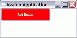
Figure 3: Button with red background.
Listing 4:
Like any other controls, you can also define the events of the controls within the XAML element itself. For example, the Click attribute of the <Button> represents the click event handler of the button. The following code sets the Click attribute of the button as ButtonClickMethod, which means when the button is clicked; the code written on the ButtonClickMethod will be executed.
<Button Name="btn1" Height="50" Width="200" Background="Red" Foreground="White" FontFamily="Times New Roman" FontSize="14" Content="Red Button" Click="ButtonClickMethod"/>
Control Event Handlers:
Now lets define the ButtonClickMethod. I am using VB language. The code is always written within <![CDATA[ ]]> element. My ButtonClickMethod is listed in Listing 5. As you can see from Listing 5, I can also set the button's properties at run-time in my code as well. I also generate a message box when the button is clicked.
Listing 5:
<![CDATA[
Private Sub ButtonClickMethod(ByVal sender As Object, ByVal e As EventArgs)
btn1.Background = Brushes.Green
MessageBox.Show("Red Button clicked")
End Sub
]]>
Listing 6: The final code is listed in Listing 6.
<DockPanel>
<Button Name="btn1" Height="50" Width="200" Background="Red" Foreground="White" FontFamily="Times New Roman" FontSize="14" Content="Red Button" Click="ButtonClickMethod"/>
<x:Code>
<![CDATA[
Private Sub ButtonClickMethod(ByVal sender As Object, ByVal e As EventArgs)
btn1.Background = Brushes.Green
MessageBox.Show("Red Button clicked")
End Sub
]]>
</x:Code>
</DockPanel>
The output of Listing 6 generates Figure 4. As you can see from this Figure, when you click on the button, it changes the color of the button to green and generates a message box saying "Red Button clicked".
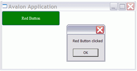
Figure 4. Button click output
Communication between two Controls:
Now let's create one Windows application with a TextBox and a Button control on it. In this application, we will change the TextBox.Text property on button click event. Our final Window looks like Figure 5.
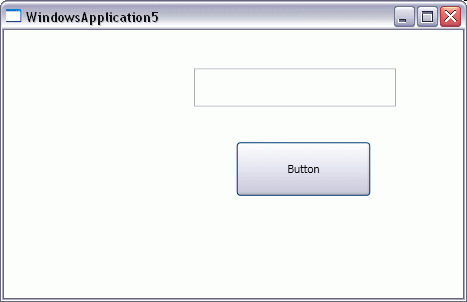
Figure 5: A Window with a TextBox and a Button control
Listing 7:
The code for creating a Windows, a TextBox, and a Button is listed in Listing 7. In this code, the <Window /> element represents a Window.
<Window x:Class="WindowsApplication5.Window1"
xmlns="http://schemas.microsoft.com/winfx/avalon/2005"
xmlns:x="http://schemas.microsoft.com/winfx/xaml/2005"
Title="WindowsApplication5">
<Grid Height="244" Width="469">
<TextBox VerticalAlignment="Top" HorizontalAlignment="Left" Grid.Column="0" Grid.ColumnSpan="1" Grid.Row="0" Grid.RowSpan="1" Margin="190,26.5,0,0" Width="202" Height="38" Name="textBox1">
</TextBox>
<Button VerticalAlignment="Top" HorizontalAlignment="Left" Grid.Column="0" Grid.ColumnSpan="1" Grid.Row="0" Grid.RowSpan="1" Margin="232,99.5,0,0" Width="135" Height="55" Name="button1" Click="ButtonClickMethod">Button
</Button>
</Grid>
</Window>
Listing 8:
Now let's add code to change Text property of TextBox as listed in Listing 8. This code should look familiar. On button click event handler, we are simply setting textBox1.Text to "Button clicked" string.
<x:Code>
<![CDATA[
Private Sub ButtonClickMethod(ByVal sender As Object, ByVal e As EventArgs)
textBox1.Text = "Button clicked"
End Sub
]]>
</x:Code>
Listing 9.
Now let's run the application and click on the button. The output looks like Figure 6.
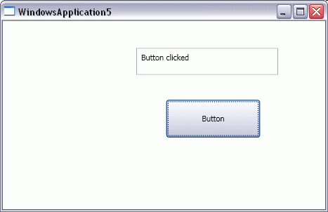
Figure 6:
In-line versus Code-behind:
Similar to ASP.NET programming model, we have choice to write code in XAML document itself or in a separate file as code-behind. In our previous example, we used the following syntax to write in-line code.
<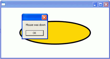
Figure 7:
Summary:
This article is a basic introduction to XAML. In this article, you saw how to create simple user interfaces and controls using XAML. You also learnt how we can create controls and write event handlers for the controls.
NOTE: THIS ARTICLE IS CONVERTED FROM C# TO VB.NET USING A CONVERSION TOOL. ORIGINAL ARTICLE CAN BE FOUND ON C# Corner (http://www.c-sharpcorner.com/).