This article defines the xaml with code behind and tooltip and cursor property in xaml.
XAML with code behind
To define the xaml with code behind we create a Button in xaml. and double click on the Button.
XAML code
<Window x:Class="WpfApplication56.MainWindow"
xmlns="http://schemas.microsoft.com/winfx/2006/xaml/presentation"
xmlns:x="http://schemas.microsoft.com/winfx/2006/xaml"
Title="MainWindow" Height="350" Width="525">
<Button x:Name="button" Width="200" Height="25" Click="button_Click">Click me</Button>
</Window>
Now double click on the Button and add the below code.
VB code
using System;
using System.Collections.Generic;
using System.Linq;
using System.Text;
using System.Windows;
using System.Windows.Controls;
using System.Windows.Data;
using System.Windows.Documents;
using System.Windows.Input;
using System.Windows.Media;
using System.Windows.Media.Imaging;
using System.Windows.Navigation;
using System.Windows.Shapes;
namespace WpfApplication56
{
public partial class MainWindow : Window
{
public MainWindow()
{
InitializeComponent();
}
private void button_Click(object sender, RoutedEventArgs e)
{
MessageBox.Show("Hello! Rohatash", "Nice!");
}
}
}
Now run it and click on the Button.
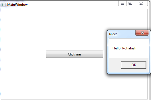
Figure1.gif
Cursor and Tooltip properties
Cursor property is used to change the shape of the cursor and Tooltip property is used to display explanatory text when the mouse rest on the Button. This control is helpful in providing a quick help to users or display information when the user moves the pointer over an associated control.
XAML code
<Window x:Class="MainWindow"
xmlns="http://schemas.microsoft.com/winfx/2006/xaml/presentation"
xmlns:x="http://schemas.microsoft.com/winfx/2006/xaml"
Title="MainWindow" Height="350" Width="525">
<Canvas>
<Button Canvas.Left="10" Canvas.Top="10" ToolTip="Please press the Button" Content="Button" Height="23" Name="Button1" Width="75" Cursor="Hand" />
</Canvas>
</Window>
Now test it.
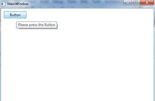
Figure2.gif