Slider control
The Slider is a simple control on the surface providing a track and a "thumb" that enables value changing. Slider work for zoom in or zoom out the images. Slider can work either horizantly or vertically.
Creating Slider control in XAML
<Slider Height="23" HorizontalAlignment="Left" Margin="10,10,0,0" Name="Slider1" VerticalAlignment="Top" Width="247" />
The Width and Height property represents the width and the height of the control and Name property represents name of the control.
The Slider control looks like this.

Figure1.gif
Vertical Slider control
Set the property Orientation= Vertical.
<Slider Height="220" Orientation="Vertical" HorizontalAlignment="Left" Margin="10,10,0,0" Name="Slider1" VerticalAlignment="Top" Width="36" />
The Slider control looks like this.

Figure2.gif
Important property
Slider control has the following properties.
Minimum - The number that represents the lowest (left or bottom) value.
Maximum - The number that represents the highest (right or top) value.
LargeChange - The slip when a large change in value is desired.
SmallChange - The slip when a small change in value is desired.
Foreground - This property is used to describes the foreground color.
Background - This property is used to describes the background color.
For example
Creating a Image control and a slider control in XAML.
XAML Code
<Window x:Class="MainWindow"
xmlns="http://schemas.microsoft.com/winfx/2006/xaml/presentation"
xmlns:x="http://schemas.microsoft.com/winfx/2006/xaml"
Title="MainWindow" Height="350" Width="525">
<Border BorderBrush="Black" BorderThickness="1" Height="208"
Width="433" Margin="20">
<Canvas Height="200" Width="200">
<Canvas.RenderTransform>
<TransformGroup>
<ScaleTransform ScaleY="-1" />
</TransformGroup>
</Canvas.RenderTransform>
<Rectangle Canvas.Top="-146" Canvas.Left="-55" Width="192"
Height="103" Stroke="darkgreen" StrokeThickness="3">
<Rectangle.Fill>
<ImageBrush ImageSource="/WpfApplication65;component/Images/file4.jpg" />
</Rectangle.Fill>
<Rectangle.RenderTransform>
<ScaleTransform
ScaleX="{Binding ElementName=slider,Path=Value}"
ScaleY="{Binding ElementName=slider,Path=Value}" />
</Rectangle.RenderTransform>
</Rectangle>
<Slider Name="slider" Minimum="0" Maximum="3" TickPlacement="BottomRight" TickFrequency="0.2"
IsSnapToTickEnabled="True" Canvas.Left="-63" Canvas.Top="-243" Height="22" Width="222" Value="1" />
</Canvas>
</Border>
</Window>
Now run the application.
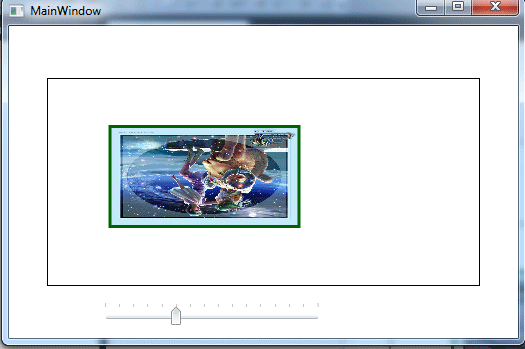
Figure3.gif
Now if you change the slider values, you will see that the size of image also changes according to the slider values.
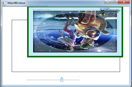
Figure4.gif